Incentivized Reading
2023
I had been following my line of research and experiments for my thesis, which was about happiness.
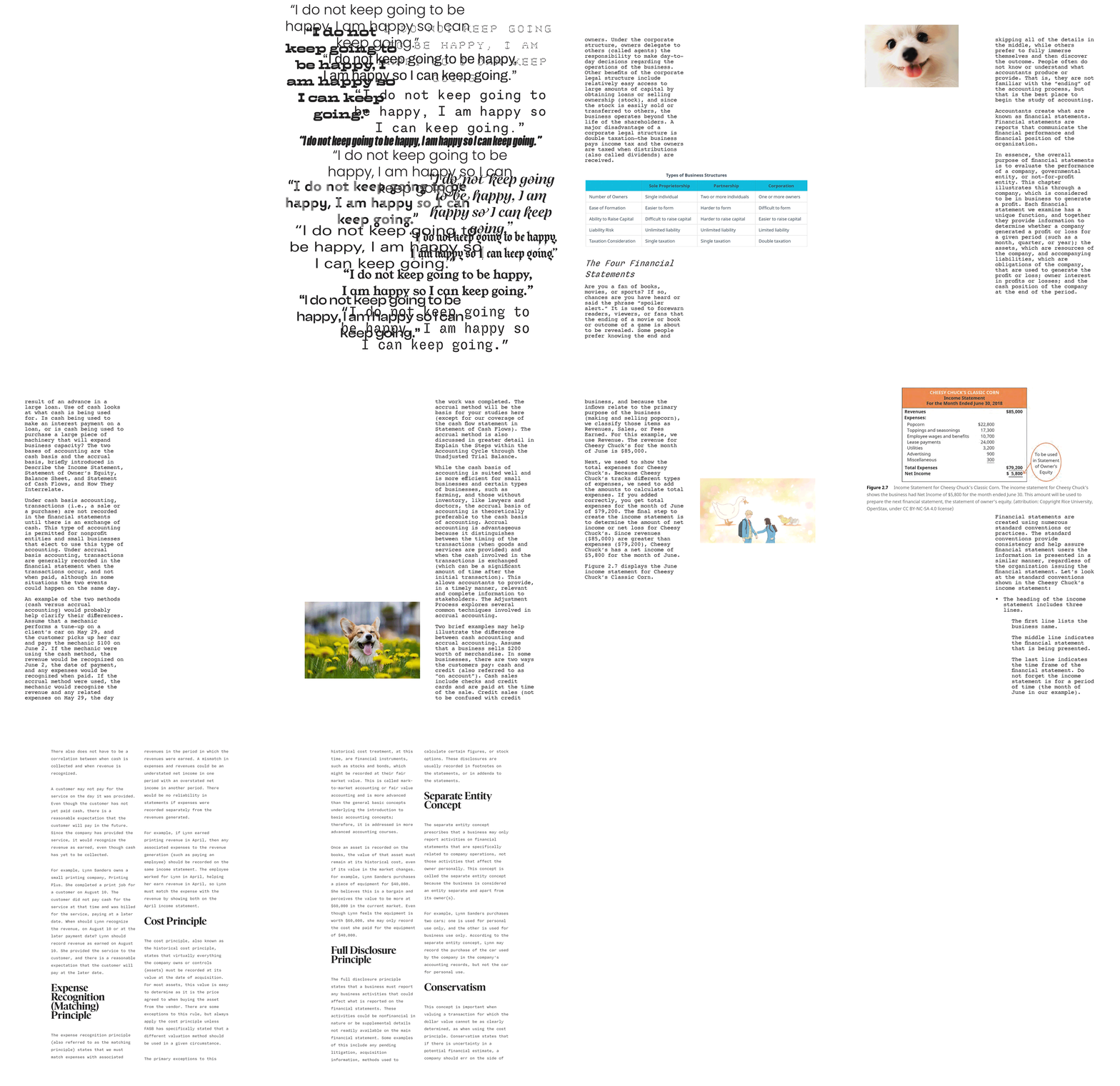
My way to get through life is "I do not keep going to be happy, I am happy so that I can keep going."
At the time, I was taking an Accounting Fundamentals course, but for the life of me could not read through the textbook.
I thought, with the fuel of happiness (and the change in typography) I could finally get myself to read the text.
I tried different modes of happiness, which can be see through the incentives to read the text.
In each of the chapter was both a different mode of incentive and a different typography usecase.
The first chapter had the standard full-page-width textbox, but I changed the font to try and keep it more engaging.
At the end of the chapter was a snack pack, as a post-activity incentive.
Chapter two was so long it was split into two parts, but the same methodology applies to both sections.
A more narrow text-column, and a persistent visual incentive was utlized, as well as a way to check my progress through the section.
In section one, there is an image of a happy dog on every spread, (hopefully) giving me joy and making life just slightly more pleasant as I read.
In section two, images of dogs were replaced with pictures from my favorite manga/anime, encouraging me to finish reading so I can watch it.
In chapter three, the format was inspired by a newspaper, with two narrow columns per page. Another persistent incentive was used, but this time it was a candy that you could eat every single time you flipped the page.

Original textbook: